Configuring Object Presentation (Widget System)
Valeros allows you to control how heritage objects are displayed to end users through simple configuration files.
Video: Hiding widgets to customize how objects are displayed in list view
Presentation Configuration Files
Object presentation is controlled through configuration files in src/app/config/presentation/:
list-presentation.config.ts- Configure how objects appear in list viewgrid-presentation.config.ts- Configure how objects appear in grid viewmap-presentation.config.ts- Configure how objects appear on the mapdetails-presentation.config.ts- Configure how objects appear on the details page
Each configuration file exports a NodePresentationConfig object that defines which widgets are available and how they should be displayed.
"Objects" or "nodes"?
Throughout this documentation, we use "object" and "node" somewhat interchangeably. Internally, Valeros uses "node" in the linked data sense (hence NodePresentationConfig), but in these guides we typically use "object" for clarity. Both refer to the same thing: a heritage object, person, place, or other entity in your dataset.
Basic Structure
A presentation config has the following structure:
export const DETAILS_PRESENTATION_CONFIG: NodePresentationConfig = {
  widgets: [
    nameWidget,
    descriptionWidget,
    mediaWidget,
    // ... more widgets
  ],
};
Configuration Properties
widgets- Array of widgets that defines which widgets are shown and in what ordershowArrowIndicator- Whether to show an arrow indicator on clickable items (optional)
What is a Widget?
The widget system is the core of Valeros's configuration-driven approach. Widgets let you map data properties (creator, dateCreated, associatedMedia, ...) to visual components (LinkWidget, TextWidget, MediaWidget, ...) without writing code. Instead of building custom components for each data type, you configure which (reusable) widgets handle which properties.
Understanding Widgets
Each widget is an object that connects data properties to visual components:
export const materialWidget: Widget = {
  id: 'material',
  properties: ['material'],
  componentId: 'link-widget',
  options: {
    propertyLabel: 'Materiaal',
    icon: 'package',
  },
};
Widget Properties
id- Unique identifier for the widgetproperties- Array of data property names this widget handles (optional, see Widgets Without Properties)componentId- The component used to render this widget (see Built-in Widgets for available components)options- Configuration options passed to the widget component (optional)isFallback- When true, this widget handles any properties that have data but don't match other widgets (optional, see Handling Unmatched Properties)hidden- When true, this widget is not shown (optional)
Widget Options
All widgets support base options like propertyLabel, icon, and position (defined in BaseWidgetOptions).
Individual widget components can extend these with component-specific options. For example, TextWidgetOptions (used by TextWidget) extends BaseWidgetOptions to add maxLength, largeFont, and other text-specific options.
Widget Positioning
Widgets can be positioned in different areas using the position option.
Implementation Details
The widget positioning layout structure is defined in NodeComponent. Widget position grouping logic is handled by WidgetService.
Available Positions
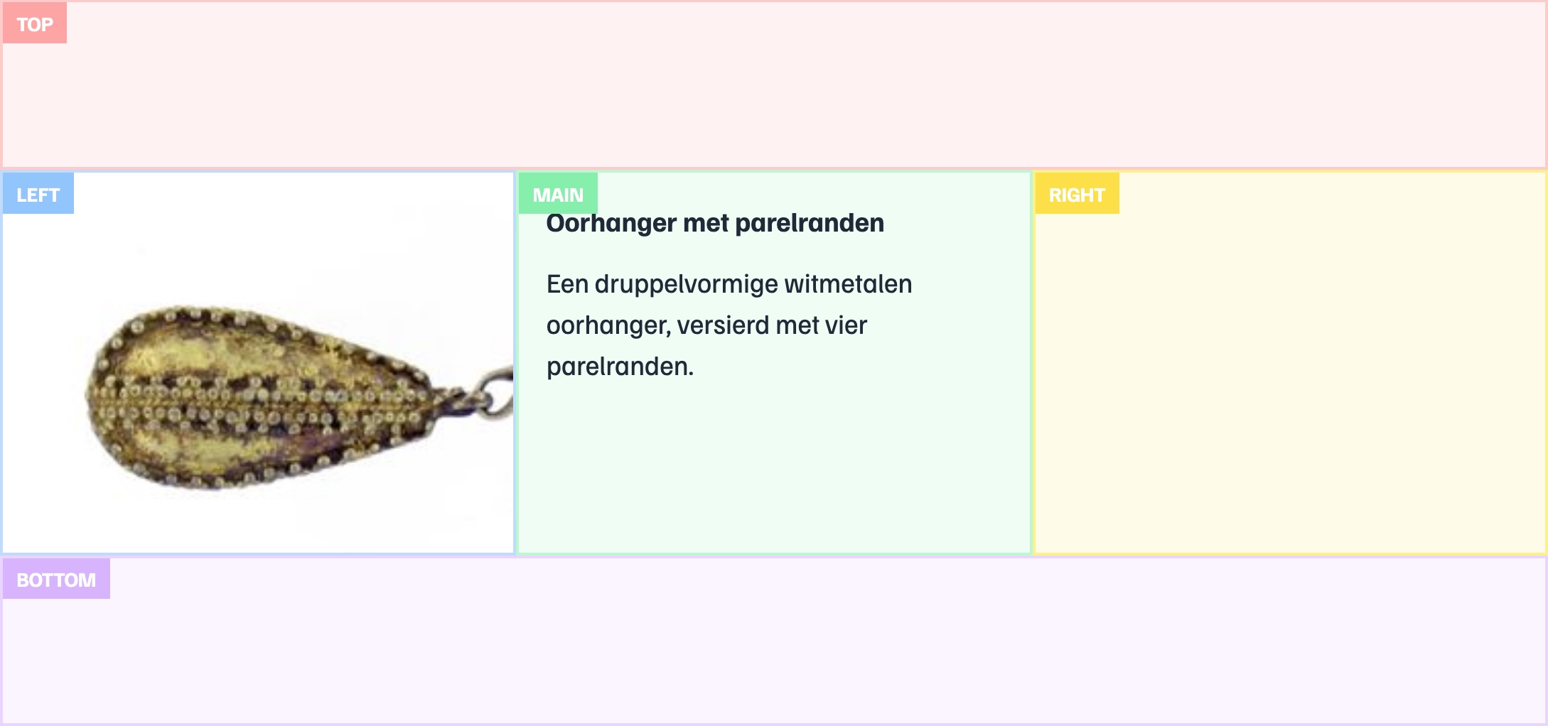
top- Full-width area at the topleft- Left sidebar (on desktop)main- Main content area (default)right- Right sidebar (on desktop)bottom- Full-width area at the bottom
Example: Positioning Widgets
export const mediaWidget: Widget = {
  id: 'media',
  properties: ['associatedMedia'],
  componentId: 'media-widget',
  options: {
    showPropertyLabel: false,
    position: 'left', // Display in left sidebar
  },
};

export const imageThumbWidget: Widget = {
  id: 'image-thumb',
  properties: ['associatedMedia'],
  componentId: 'image-gallery-widget',
  options: {
    position: 'top', // Display at the top
    noPadding: true, // Extend edge-to-edge, strip default padding
  },
};
Responsive Behavior
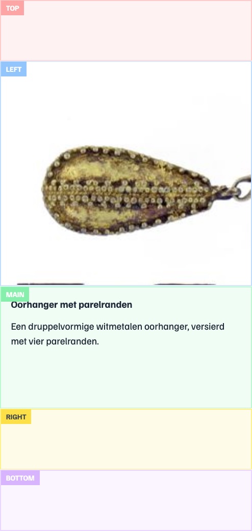
On mobile devices, the layout collapses into a single column in this order:
- Top
- Left
- Main
- Right
- Bottom
Common Tasks
Changing Widget Order
Widgets are displayed in the order they appear in the widgets array. Simply reorder the widgets:
export const DETAILS_PRESENTATION_CONFIG: NodePresentationConfig = {
  widgets: [
    mediaWidget, // Shows first
    nameWidget, // Shows second
    descriptionWidget, // Shows third
  ],
  // ...
};
Showing Widgets for Properties
To display a widget for a property in your data, create a widget configuration that maps the property to an existing widget component.
Option 1: Define in widgets.ts (recommended for reusability)
export const customWidget: Widget = {
  id: 'custom',
  properties: ['customProperty'],
  componentId: 'link-widget',
  options: {
    propertyLabel: 'Custom Field',
    icon: 'star',
  },
};
Then import and add it to your presentation config:
import { customWidget } from './widgets/widgets';

export const DETAILS_PRESENTATION_CONFIG: NodePresentationConfig = {
  widgets: [
    nameWidget,
    customWidget,
    // ...
  ],
  // ...
};
Option 2: Define inline (for view-specific widgets)
export const DETAILS_PRESENTATION_CONFIG: NodePresentationConfig = {
  widgets: [
    nameWidget,
    {
      id: 'custom',
      properties: ['customProperty'],
      componentId: 'link-widget',
      options: {
        propertyLabel: 'Custom Field',
        icon: 'star',
      },
    },
  ],
  // ...
};
TIP
This section covers using existing widgets (see Built-in Widgets) for your properties. To create entirely new widget components with custom functionality, see Creating Custom Widgets.
Passing Custom Options to Widgets
Widget options allow you to customize behavior. Here's an example with multiple options:
export const descriptionWidget: Widget = {
  id: 'description',
  properties: ['description'],
  componentId: 'link-widget',
  options: {
    showPropertyLabel: false, // Hide the property label
    largeFont: true, // Use larger font
    maxLength: 200, // Truncate at 200 characters
  },
};
Different widget components accept different options. Check the widget's implementation to see available options.
Widgets Without Properties
Widgets can omit the properties field if they don't depend on specific data properties:
export const separatorWidget: Widget = {
  id: 'separator',
  componentId: 'separator-widget',
  options: {
    showPropertyLabel: false,
  },
};
These widgets will always appear when included in the widgets array:
export const DETAILS_PRESENTATION_CONFIG: NodePresentationConfig = {
  widgets: [
    nameWidget,
    separatorWidget, // Always appears at this position
    descriptionWidget,
  ],
};
Handling Unmatched Properties
Use a fallback widget to display properties that don't have specific widgets defined. Set isFallback: true on a widget:
export const fallbackWidget: Widget = {
  id: 'fallback',
  componentId: 'json-widget',
  isFallback: true, // This widget handles unmatched properties
};
The fallback widget's position in the widgets array determines where unmatched properties appear:
export const DETAILS_PRESENTATION_CONFIG: NodePresentationConfig = {
  widgets: [
    nameWidget,
    descriptionWidget,
    fallbackWidget, // Unmatched properties appear here
    datasetWidget,
  ],
};
In this example, name, description and dataset properties are matched by their respective widgets. Other properties like type or birthDate that don't match any specific widget would be handled by the fallbackWidget.
TIP
Widget matching logic is implemented in WidgetService. Check out src/app/widgets/widget.service.ts for details.